Odoo UI
How Odoo's interface is built, screen by screen. Every Odoo user knows this layout by heart, so anything we build inside Odoo starts here.
Screenshots: Odoo 20 Enterprise with demo data. What differs in 18 and 19 is at the end.
Four layers
Every Odoo screen stacks the same four layers. Each has one job, and users know where to look for it.
Navbar
Always on top. Moves between apps and within an app; messages, activities and the user menu on the right.
Control panel
Per screen: the main action, where you are, search, and how you see the records.
View
The data itself: a list, kanban, form, calendar, pivot or graph.
Overlays
On top of the view, briefly: dialogs, dropdowns and notifications.
Home menu
The start of every session. Each app is one tile. Users switch apps here or with the app icon in the navbar, nowhere else.
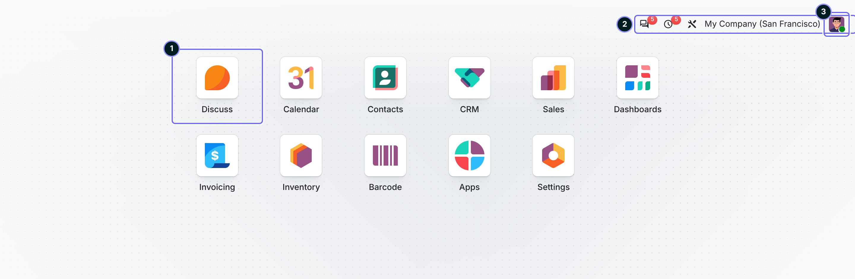
- App tile Opens the app at its default screen. One tile per installed app.
- Systray Messages, activities and the company switcher. A counter only when something waits.
- User menu Preferences, documentation, log out.
Ours One tile per product, with our ring icon. We add nothing to the systray or the user menu.
The frame and the list
Every app screen has the same frame: navbar on top, control panel below it, the view underneath. The list is Odoo's most used view.
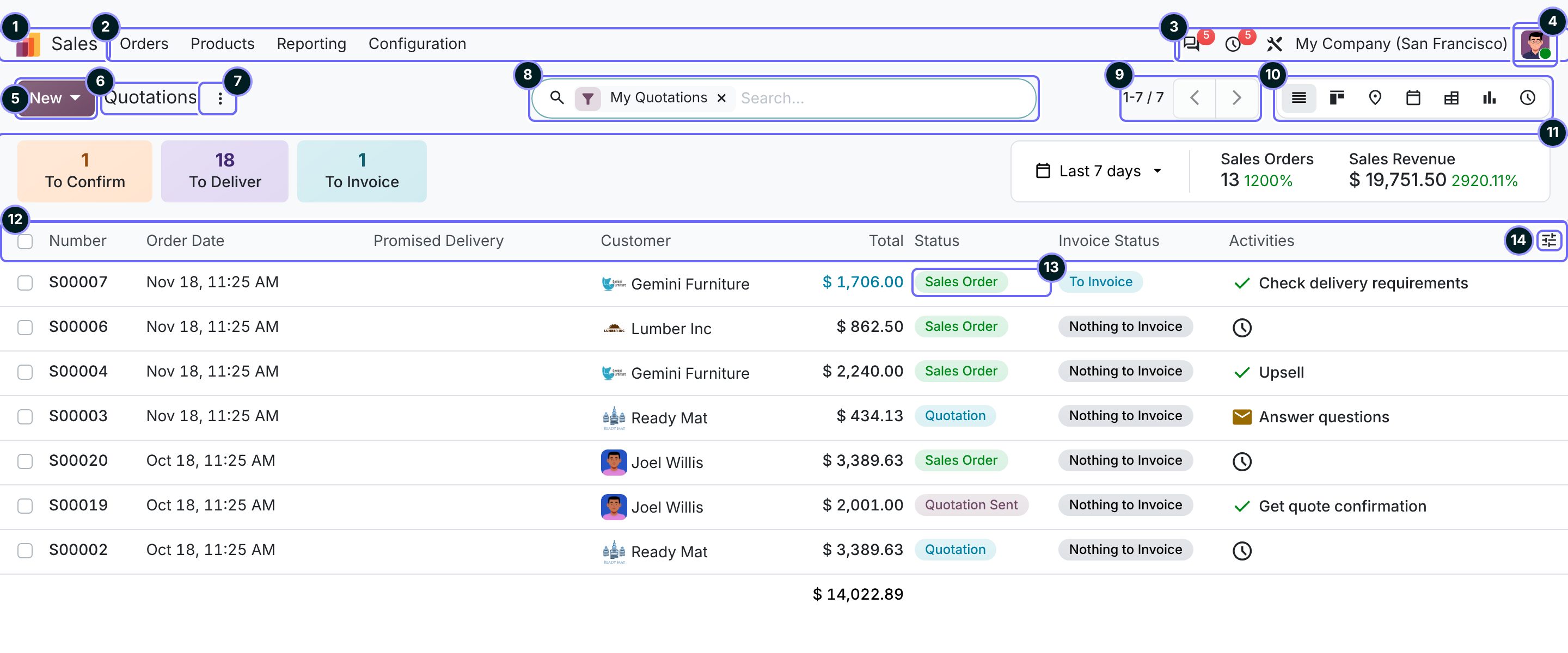
- App icon and name Back to the home menu. The name says which app you are in.
- Top menu The app's sections, each a dropdown. Configuration is always last.
- Systray Messages, activities, company. The same in every app.
- User menu Preferences and log out.
- New The one filled button. Creates a record; in 20 a caret offers other ways to add.
- Breadcrumb Where you are and the way back. Each record you open adds a crumb.
- Action menu The three dots: import, export, and actions on the selected rows.
- Search One bar for search, filters, grouping and favourites. Active choices show as chips.
- Pager Which records you see; next and previous page.
- View switcher The same records as list, kanban, map, calendar, pivot, graph or activities.
- Dashboard tiles New in 20 on some lists. Counts that act as filters: a click shows those records.
- Column headers Click to sort, drag to resize. The checkbox selects all rows.
- Status badge One coloured pill per row with the record's state.
- Optional columns Users switch extra columns on and off themselves.
Ours New as the only filled button, at most six columns, one status badge, and the whole row opens the record.
Search, filter, group
Searching, filtering and grouping all live in one dropdown under the search bar. Users do not look for tabs or filter chips anywhere else on the page.
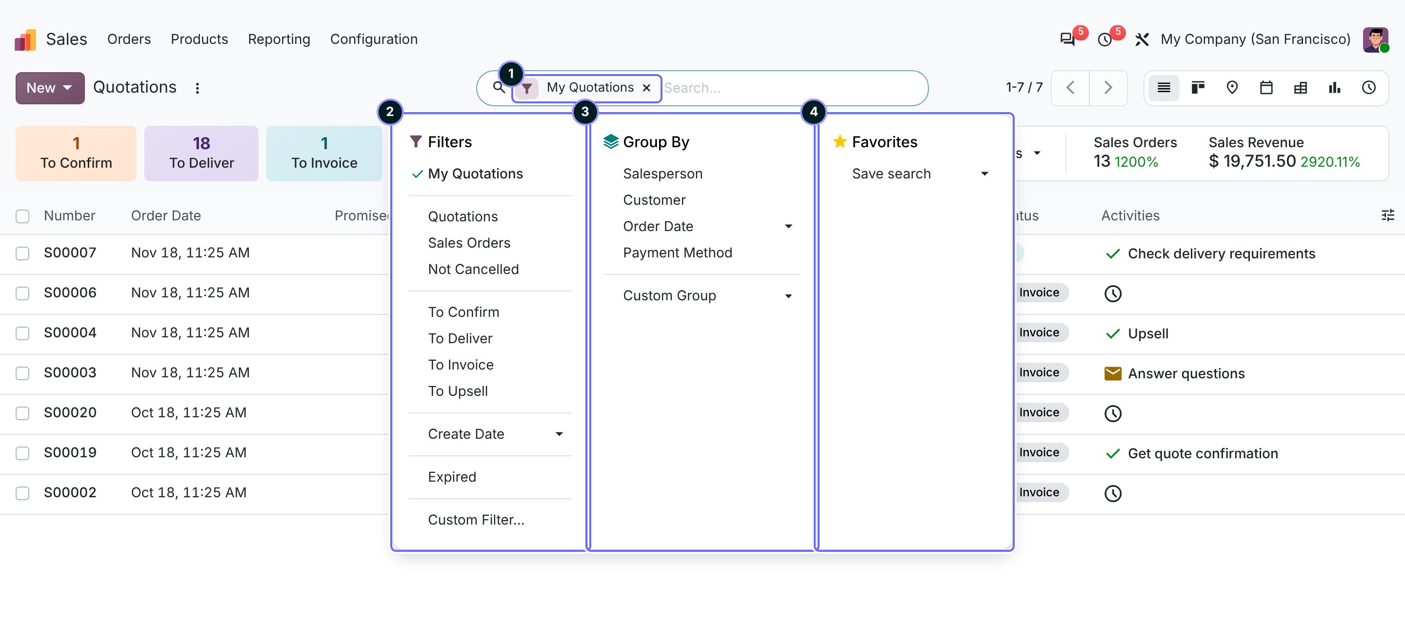
- Facet An active filter or grouping. The cross removes it.
- Filters Ready-made filters in groups. Two in one group combine with or, across groups with and.
- Group By Groups the list or kanban by a field.
- Favorites Saved searches, personal or shared.
Ours At most eight filters and five groupings, status always among them. Never a search or filter bar of our own.
The form
One record. Actions on the left of the header, its state on the right, the data on a sheet, the conversation in the chatter. Odoo saves on its own.
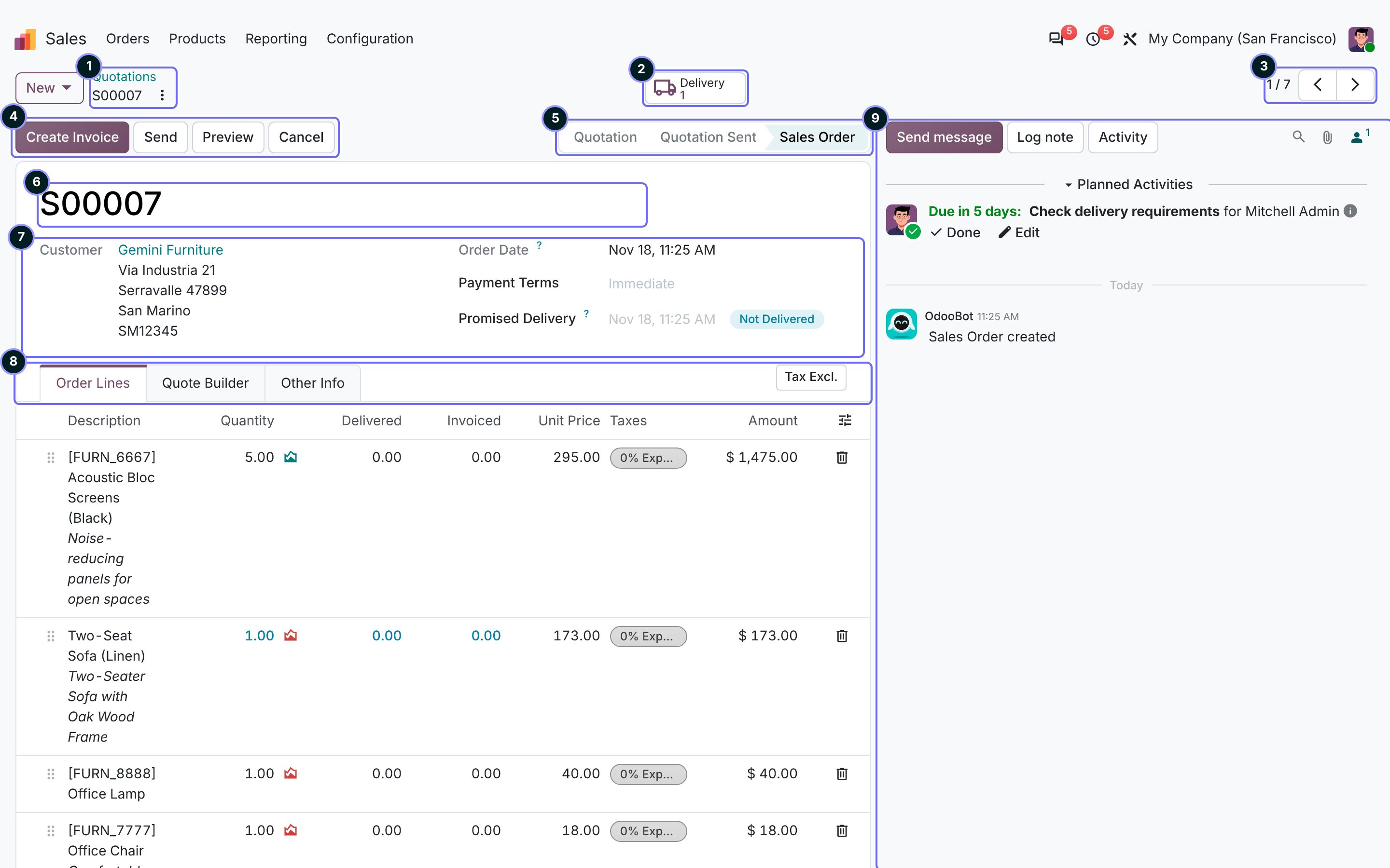
- Breadcrumb The list it came from and the record's name. The dots beside it hold duplicate, archive and delete.
- Smart buttons Related records with a count; a click opens them. In 20 they sit in the control panel.
- Record pager Next or previous record from the list, without going back.
- Header buttons The record's actions. The first, filled one is the next step; on a phone it is the only one shown.
- Statusbar The lifecycle, with the current stage highlighted.
- Title The record's name, large, at the top of the sheet. Nothing under it.
- Field groups Label and value in two columns; fields that belong together sit together.
- Tabs Lines and details that do not fit above. The first tab is the one used most.
- Chatter Messages, notes, activities and the change log. Beside the form on wide screens, below it on narrow ones.
Ours One filled button, first in the header. The title plus at most eight fields above the tabs. No help text under the title.
Kanban
Records as cards in columns, usually one column per stage. Users drag a card to move it. On a phone, this is the view an app opens first.
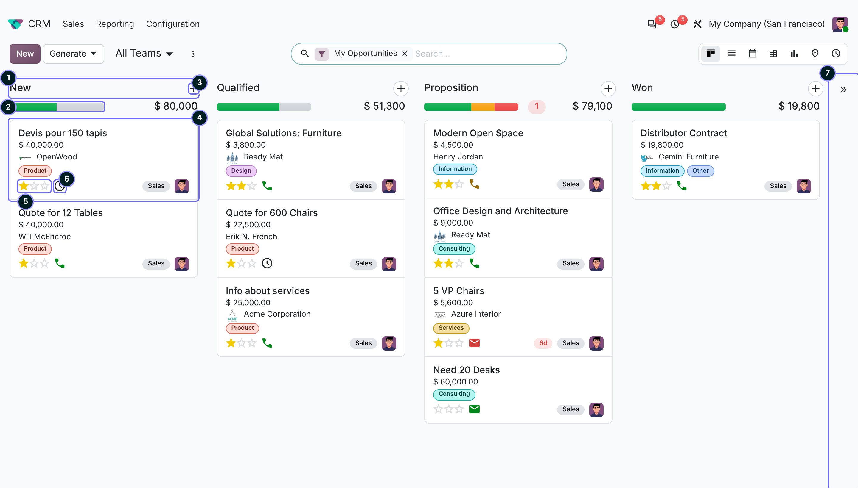
- Column A stage with its name and total.
- Progress bar Cards per activity state: green planned, amber today, red overdue. A click filters the column.
- Quick create Adds a card with a few fields, without leaving the board.
- Card One record. The whole card opens it.
- Priority Stars, set with one click.
- Activity The next to-do and whether it is late; a click plans or completes one.
- Add a stage A new column at the end of the board.
Ours A card shows at most four lines and one status signal, and has no buttons of its own.
Settings
The settings of every app live on one page, one section per app. Changes wait for Save.
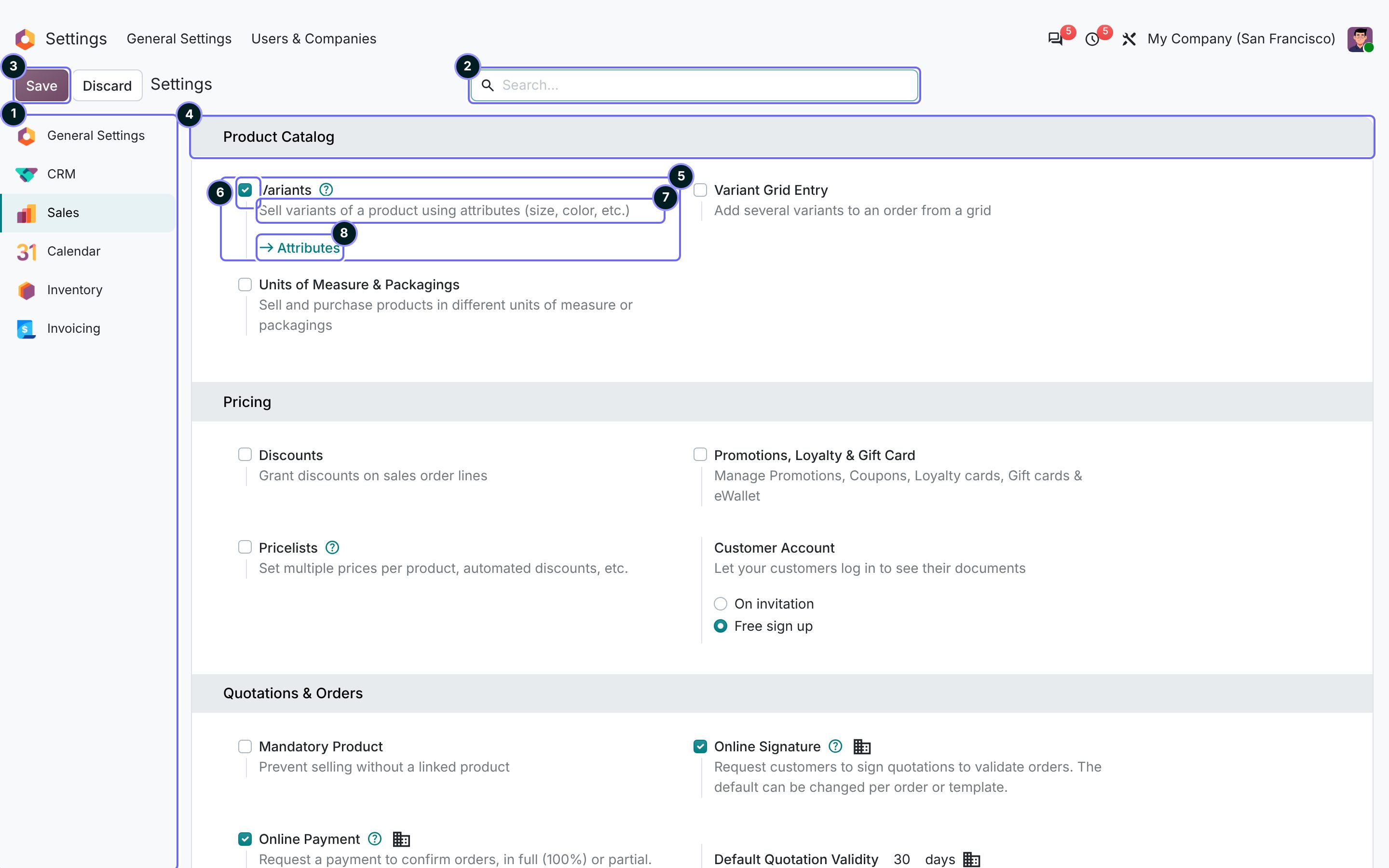
- App list One entry per app; a click jumps to its section.
- Search Finds any setting by name, across all apps.
- Save and Discard Nothing applies until Save. Settings are a form, not a panel of live switches.
- Block A group of settings under a title.
- Setting One row: checkbox, name, one line of help, optional extra fields.
- Checkbox Turns a feature on; often installs a module on Save.
- Help One line that says what the setting does.
- Link Opens the configuration behind the setting.
Ours One section per product, at most three blocks, checkboxes and not switches, one line of help per setting.
Wizard
A dialog for one short step, on top of the current screen. The screen behind stays visible, so the user keeps their place.
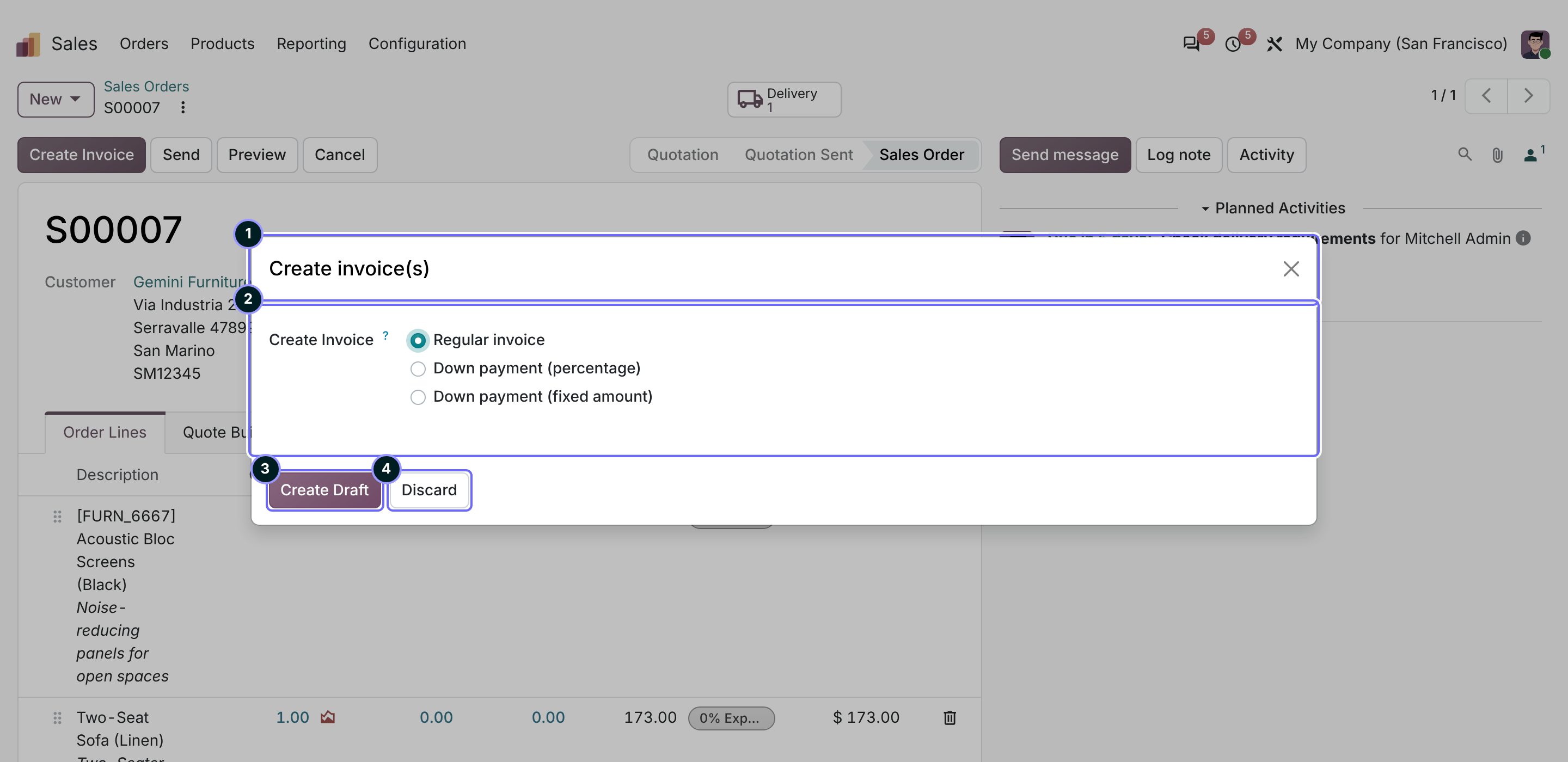
- Title What the step does.
- Fields Only what this step needs.
- Primary button Does the step. Always first, on the left.
- Discard Closes without changes. In 18 and 19 it reads Cancel.
Ours At most four fields, one filled button with a verb, Discard last.
Empty
When a view has no records, Odoo shows the action's help in the middle. New stays the way to start.
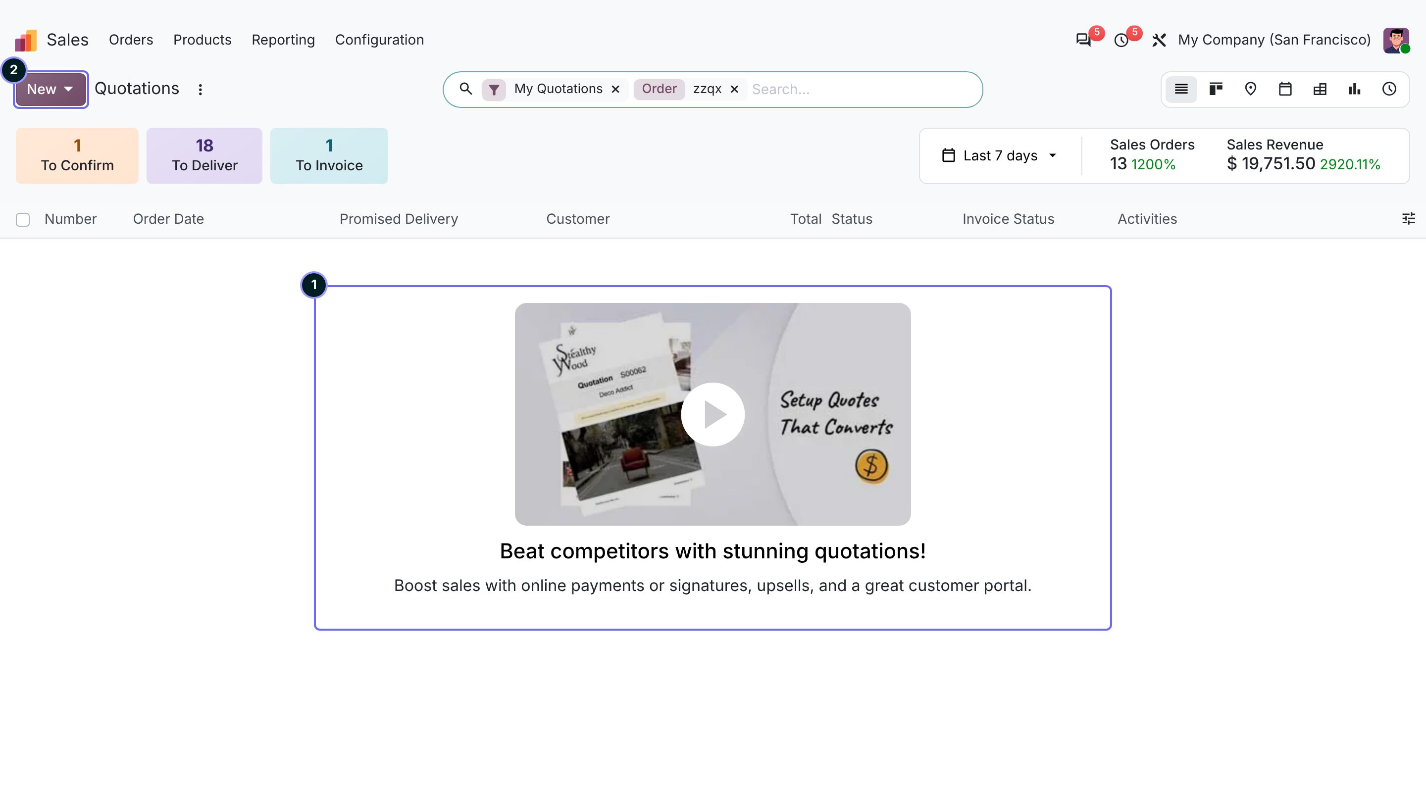
- Help A title and a line; in Odoo's own apps often a picture or video.
- New The action that ends the empty state.
Ours The state, then where the action is: "No agents yet. Add one with New." No picture, no explainer.
Phone
Below 768 pixels Odoo rearranges the same parts. It opens kanban instead of the list, hides search behind an icon and shows only the first header button.
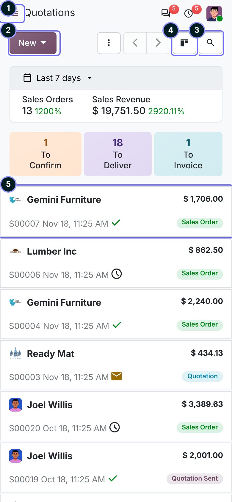
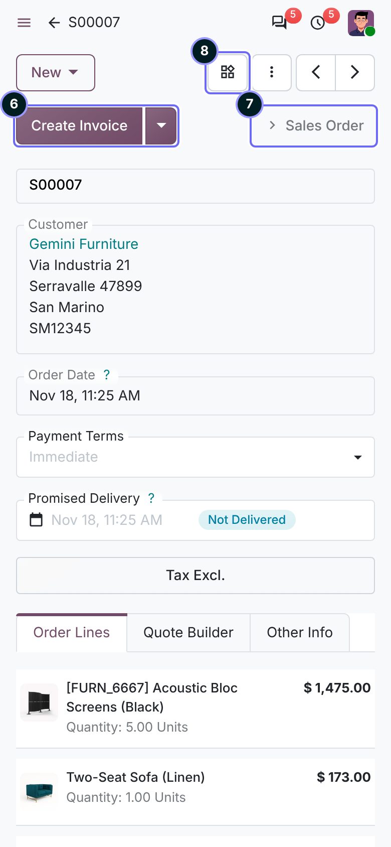
- Menu The app's top menu, as a side panel.
- New Still the one filled button.
- Search Behind the magnifier.
- View switcher One button with a dropdown.
- Card Lists open as cards on a phone.
- Main action Only the first header button; the rest is behind the arrow.
- Stage Only the current stage of the statusbar.
- Smart buttons Folded into one button.
Ours Every model a phone user opens needs a good card, and the main action is the first header button.
Odoo 18, 19 and 20
The structure is the same in all three. What moved:
| What | 18 | 19 | 20 |
|---|---|---|---|
| Chatter beside the form | From 1534 px | From 1400 px | From 1400 px |
| Header buttons on a phone | All in the menu | First one, rest in ⋮ | First one as split button |
| Secondary buttons | Grey | Grey | White with a border |
| Statusbar | Arrows | Arrows | Flat segments |
| Icons | Font Awesome | Font Awesome | Material Symbols |
| Settings page | Plain page | Plain page | Sections on cards |
| Fields on a phone | Underlined | Underlined | Each in a box; checkboxes as switches |
| Smart buttons | On the form | On the form | In the control panel |
What this means for us
Odoo's frame, our restraint. We never restyle the navbar, control panel, search, chatter or settings. We use Odoo's own views and widgets, and our taste shows in what we leave out: one filled button, fewer fields, one status, no explainers.